In September 2026, the United Nations General Assembly adopted the “Correct the Map” resolution (Correct the Map). The document calls for phasing out the traditional Mercator projection in favor of the Equal Earth projection.
The grid familiar from school geography classes, originally developed in 1569, dramatically exaggerates the size of landmasses as they extend from the equator toward the poles. The shift to a new equal-area projection is designed to rectify this distortion and display nations in their true proportions.
Which Countries Changed and by How Much
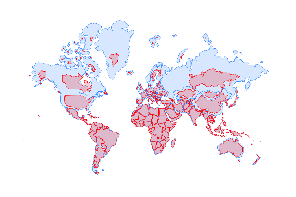
The new Equal Earth map does not redraw physical borders on the ground—it merely removes the “optical illusions” dating back to 1569. If the visual area of countries under the Mercator projection is taken as 100%, on the new map they shrink to their actual scale:
- Greenland — down by 82%. The starkest example of distortion. Under Mercator, the island appears roughly equivalent in size to the entire African continent, whereas in reality it is 14 times smaller.
- Canada — down by 62%. On legacy maps, Canada appeared as a colossus visually exceeding the whole of South America. In reality, it covers roughly half that area.
- Russia — down by 57%. Situated at high northern latitudes, the country’s surface area was magnified on the Mercator projection by more than 2.3 times (+130%). On the new map, it retains its status as the world’s largest country by area, but ceases to visually encompass half the globe.
- Europe — down by 45–50%. Northern and Central European nations are reduced by nearly half, while Southern European states decrease by roughly one-third.
- United States — down by 28% (with the state of Alaska shrinking by 65%).
- Africa, South America, and India — Located close to the equator, these landmasses experienced minimal distortion on the old map. However, set against the diminished northern giants, Africa and South America visually expand significantly. The new map clearly illustrates that Africa (30.3 million km²) surpasses the United States, China, India, and all of Europe combined.
Who Supported the New Map and Who Opposed It
While the resolution is non-binding, it received backing from 164 member states (including France and the United Kingdom, both of which pledged to revise primary and secondary school curricula). Concurrently, the United States voted against the measure, characterizing the initiative as a “radical ideological project” that diverts the UN from pressing security priorities. Ukraine and five other nations abstained. The objection was rooted not in cartography, but in geopolitical sensitivity: Kyiv objected to certain existing Equal Earth maps displaying occupied Crimea shaded in neutral gray.
The new projection will phase out the old standard gradually through revised educational materials, atlases, and digital services such as Google Maps.
The Mercator Projection and Colonialism
Projecting a spherical globe onto a flat surface inevitably introduces distortion. Flemish cartographer Gerardus Mercator devised his 1569 map for maritime navigation rather than academic instruction. His primary objective was preserving angles and bearings, enabling ship navigators to chart straight-line courses across long distances.
The compromise involved acute area distortion near the poles. Over centuries, what began as a mathematical necessity acquired geopolitical weight:
- Visual dominance of the North: Colonial powers across Europe, the United States, and the Russian Empire appeared disproportionately vast and commanding, while equatorial territories were diminished.
- Psychological implications: Spatial prominence in cartography is widely associated with power, economic stature, and global importance. The visual marginalization of equatorial nations persisted for generations, subtly diminishing the perceived geopolitical standing of the Global South.
For developing nations, the endorsement of the Equal Earth projection marks a formal departure from assessing global geography primarily through the utilitarian lens of early modern European seafaring.
Previous Alternatives
Several prior efforts sought to displace Mercator, though each faced significant cartographic trade-offs. The Gall–Peters projection (1970s) preserved relative areas accurately but introduced pronounced distortion to land shapes; equatorial nations appeared unnaturally stretched vertically, limiting its institutional adoption. The Winkel tripel projection (1921) offered a visual balance between shape and area, yet did not achieve true mathematical equal-area fidelity. The AuthaGraph projection (2009), a Japanese design, maintained exceptional accuracy across both land areas and shapes, but abandoned the conventional coordinate system: meridians follow angled lines, complicating basic directional orientation for general readers.
The United Nations ultimately selected the Equal Earth projection for its ability to combine rigorous area proportions with an aesthetically conventional representation of continental landmasses. After nearly five centuries, the international community has reached broad consensus on presenting the globe in its accurate physical dimensions.